
The New Neutral
How to Wear Color (the addendum)

Last week, I shared some ideas on How to Wear Color. This week I’m sharing what I consider to be The New Neutrals, with swaps that instantly make colour happen in our wardrobes.
I’ll say the most annoying thing first: most colours can work together. It’s a matter of context and of our perception of colour at different points in time, perception that is often affected by culture, norms, and trends, that ultimately makes us either enthralled by a pairing or averse to it.
But we’re playing it safe today. We’re talking about neutrals. I want to leave you with something practical that helps shake things up a bit without needing an overhaul.
The ideas here are less about colour theory and more about colour function. Less science, more behaviour, you know?
A quick google search will show you that the way we define “neutrals” shifts all the time; navy (understandable), animal print (of course), and even “avocado green” is considered neutral (as per Who What Wear).
The Neutrals
Neutral is defined as lacking strongly marked characteristics, it is what doesn’t stand out to the eye (extrapolating from google).
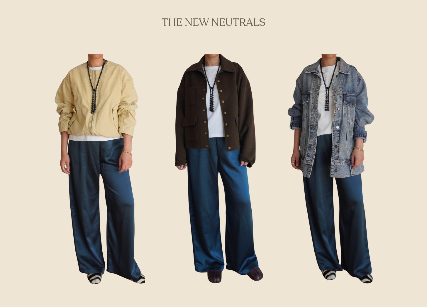
In my own closet, I consider 2 types of colours to possess these qualities
Soft, powdery, washed up, and muted, these register as colours, but function as neutral. They are diluted; think dipping your paint brush in water just once. Butter yellow is most certainly my favourite in this category. It’s an easy swap for white or beige and brings with it a certain warmth.
I have a powdery blue tank top that also functions as white, but lacks the starkness of pure white. A light grey works in the same vein, but we’re not talking about obvious contenders here.
